It has to be a 6 sided digi pack on which song I am advertising. This must involve my artists name, the title of the album, and also on the spine the name, the whole digi pack has to be connected all into one story so focusing on my style due to colours,slogans, photo placement will be crucial throughout!
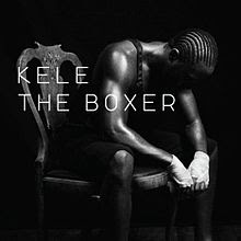
Looking for starters I wanted to look at kele's main cover of his album;

The album consists of black and white so it brings out the detainment in the artist and the light and shadows reflects of the tone in the body giving him a more dominant image.
The title of the song links it meaning very well, he looks like a boxer with elements of the white tape around his hands and the clothes that he is wearing. Look at his body language he's getting ready before he goes into a match, with him holding his head down it shows that he is thinking. The hair style gives a very board stereotype of a common boxer e.g. Daivd haye is like a replica to Kele in this photo.
The chair is good for isolating the shot and the make and style of the chair makes him look commended in his own environment and makes the atmosphere more cold and lifeless. And just because it a chair it's single and noting else in the background is getting into the way. The black and white is used to hide the face of the character and the shadow use his emotions to express his image and scenery.
The obnly problem is I find this album cover boring to the age range I want to select which is the teenage asepcts.
It good for my song and artists name as it's bring of ideas of dark performances, I might use the same method of placement but either I want a energetic but negative outcome or something like this.
But in today's aspect teenagers aim mostly at moveing imagery and scenery (looking from research and marketing)
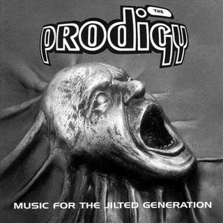
A good example for energetic and busy but negative album is this;
 The prodigy has the same taste compared to my beat of my music video as I mentioned in recent posts so it already has a good connection.
Right at the start of my video my facial expressions are the same jester and method also. The black and white brings out like a robotic and demon kind of effect maybe using the colour of red for the face could bring out more graphical connotations. The text placement and style is easy to wack on as well maybe a wrapped kind of effect or a graffiti styled to bring of the expression of the bands performance and genre that is taken upon.
And listening to their songs and whole album it relate to this front cover which I need to take into consideration.
So overall this album cover is an perfect example of eliminating and development for my front cover.
No comments:
Post a Comment